Over 100 original artworks by the brilliant illustrator Raymond Briggs are on show at the Ditchling Museum of Art + Craft, near where he lived in East Sussex.
The extent of Briggs’s creative work is incredible, including many lesser-known illustrations as well as familiar and much-loved books such as The Snowman and Father Christmas. Over a 60-year career, Briggs illustrated over 60 books, 20 with his own texts.
Being up close to the original page designs, you can see the immense detail in the artwork, and it’s fascinating to see the development of Briggs’s technical and artistic skill. The exhibition also includes his desk and other personal items never exhibited before, and a videoed interview gives an insight into Briggs’s self-deprecating humour.
Fairies, giants and witches – Briggs’s first subjects
Briggs was always sure that he wanted to be an artist: “Art was my best subject so that’s what I wanted to do.” He described how, at Wimbledon School of Art where he first trained, the director “went purple” when Briggs said he wanted to be a cartoonist. Briggs always detested pretension and found it “weird” that there was a “huge snobbery” about commercial art compared to fine art. But he was not put off his original ambition.
After training at Wimbledon and the Slade, Briggs approached Mabel George, a “dragon” of the children’s art world. She asked him, “How do you feel about fairies?” As he describes this in the video, Briggs screws up his face expressively and clenches his fist. Nevertheless, he took up the challenge, found he enjoyed it, “…and got paid. That was a great blessing!”
It’s an eye-opener to see Briggs’s first illustrations, including black and white images of fairies, giants and witches. He experimented with styles in his early books, but you can see emerging from early on a characteristic way of drawing figures and attention to detail. Briggs had already illustrated 24 books before the Mother Goose Treasury (1966) won the prestigious Kate Greenaway medal.
Books which followed, including his own Jim and the Beanstalk (1970), with clever, funny and surreal illustrations, confirmed Briggs’s early popularity.
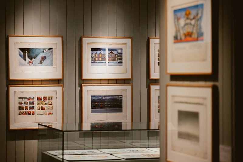
Father Christmas and The Snowman
Briggs came to a wider audience through his two best-known books, Father Christmas (1973) and The Snowman (1978), both of which were, and are, best sellers.
The portrayal of Father Christmas as a rather grumpy, working-class figure broke the usual stereotype and was loosely based on Briggs’s own father, Ernest, and himself. The hand lettering alone could take around four hours for each double page spread.
It’s fascinating to read the annotations in the margins of the proofs. His editor, Julia MacRae, asks: “Could some of the doors have wreaths on them?” to which Briggs replies: “No, middle classes only.” MacRae also requests: “No full-frontal nudity.” This didn’t prevent some complaints from parents about Santa’s cursing (the ubiquitous “blooming”) and pictures of him on the toilet.
The Snowman is perhaps Brigg’s best-loved book, known to many through the television animation. Written only a few years after the deaths of his parents and his wife, it’s a beautiful story of love and loss, drawn in soft pencil crayon. “Many people said it was a parable about death but it certainly wasn’t conscious,” Briggs commented.
The last frame shows the poignant figure of the boy with the melted snowman – the only picture on the page.
Briggs’s desk – where the magic was created
A centrepiece of the exhibition is the desk from Briggs’s house in Westmeston, where he worked on most of his illustrations, overlooking the Sussex Weald. It is covered with a mass of pencils, crayons, brushes, ink and charcoal, family photographs and piles of books.
The drawers are pulled open to reveal more art materials, whilst two angle-poise lamps and a magnifying glass show how Briggs worked on the fine detail of his pictures. Despite the huge quantity of items, the desk appears organised and orderly.

Ethel and Ernest – Briggs’s parents
The influence of Briggs’s parents and his childhood can be seen as a recurring theme in his books. His father Ernest, a milkman, appears in Father Christmas, as does his childhood house.
Ethel & Ernest (1998) is an autobiographical story about his parents’ relationship and includes evocative detail of the family home and way of life. The exhibition has very moving artwork from the book, showing Briggs’s mother’s death and his father’s subsequent decline.
Although written over 20 years after their deaths, Briggs found it too painful to work on Ethel and Ernest for more than 10 minutes at a time. “I tried to portray their lives in a way that wouldn’t offend them if they’d been alive,” he wrote.
Enduring themes: family, class, love and loss
Other books for adults included the searing When the Wind Blows, about nuclear war, and hard-hitting The Tin Pot Foreign General and the Old Iron Woman, which satirises the Falklands conflict. Briggs was one of the first illustrators in the UK to explore serious, political subjects through graphic novels.
Seeing the extent of Briggs’s work at Ditchling shows his huge, inventive talent to great effect. The themes of family, class, love and loss stand out, and the mix of humour and melancholy, as well as the variety of artistic styles and media Briggs used at different times.
Drawings by children in the adjoining art room show the enduring popularity of his books.
It’s a little tricky to get to the Ditchling Museum without a car. I was lucky to visit on a sunny day and had a pleasant mile walk from Hassocks station. It was well worth the effort.
Bloomin’ Brilliant: the life and work of Raymond Briggs runs at Ditchling Museum of Art + Craft until 27 October. The exhibition coincides with the re-publication of The Illustrators: Raymond Briggs by Nicolette Jones.

CLICK HERE TO DONATE TO OUR CROWDFUNDER
HELP US BECOME STRONGER SO THAT WE CAN CONTINUE TO DELIVER POWERFUL CITIZEN JOURNALISM!